|
Color has three observable dimensions:
None of the above properties can be assessed without comparison. That first blue might be considered rather soft until you compare it to the fifth one, which might appear quite light until you compare it to the fourth.
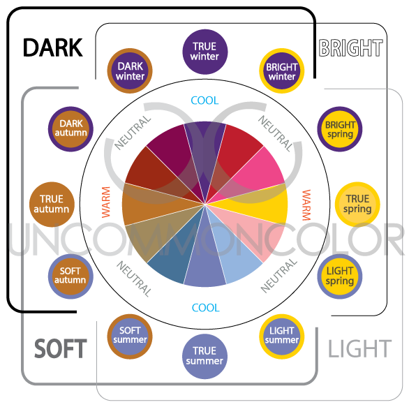
You might imagine, then, why it's nearly impossible to know your best colors without an objective way to observe them. An analysis with Uncommon Color will seek and find the appropriate temperature, value, and chroma that support your appearance. The interactions of the above properties could be combined to create twelve categories, visually represented on a chart like this:
TRUE TONES
There are four "true" tones and they correlate rather beautifully with the four seasons: Winter, Spring, Summer, and Autumn. Each True Tone has one property in common with every other True Tone:
NEUTRAL TONES
As one True Tone flows into the next (cool to warm or warm to cool), their interactions create Neutral Tones. Neutral Tones are not truly warm or cool, but they do lean one way or another, creating cool-neutrals (CN) and warm-neutrals (WN). Neutral Tones are named after the shared property of the two seasons that influence them:
Winter + Spring = Bright Winter (CN) and Bright Spring (WN).
Winter + Autumn = Dark Winter (CN) and Dark Autumn (WN). Summer + Spring = Light Summer (CN) and Light Spring (WN). Summer + Autumn = Soft Summer (CN) and Soft Autumn (WN). Interested in the visual expression of color theory and how it relates to your own coloring? I would love to show you.
|


